 WordPress.com
 Checkout

ClientWordPress.com
WordPress.comServicesProduct design
Prototyping
Design documentation
Prototyping
Design documentation
About the project
The checkout was crowded, repeated information and showed some costs only at the end. The goal was to make it simpler to lift conversion, then raise how much people spend. I led the design with one engineer, designing in 2023 and testing in 2024. Five of six changes shipped, and the page got calmer and clearer, but conversion did not clearly go up.
01 — Where we started
A checkout that had grown crowded.
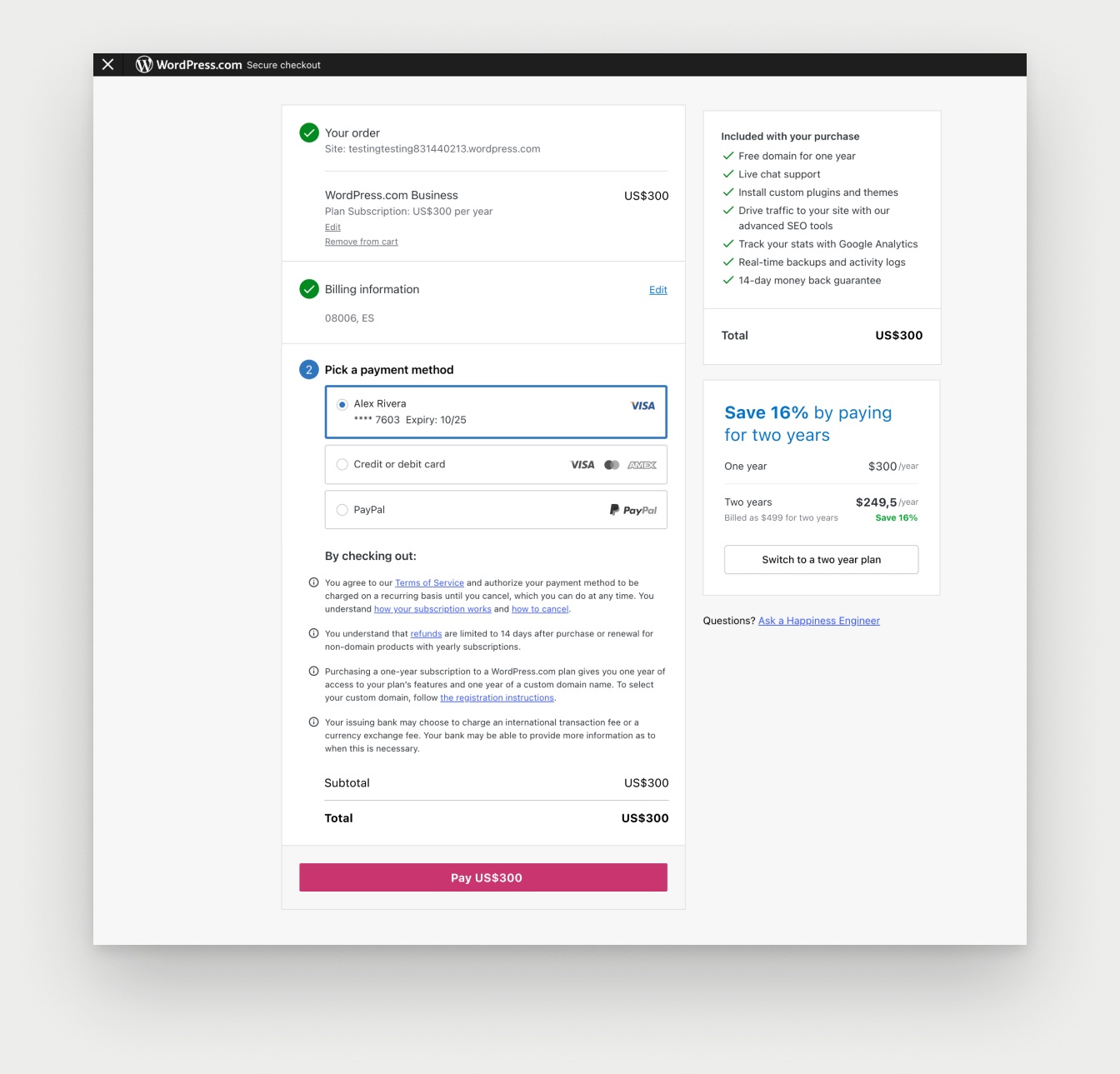
Everything sat in one long column, the legal text was a wall of four paragraphs and the pay button was below the fold. The total showed twice, next to a two-year upsell that competed with it.
02 — Map and benchmark
Every scenario, and what the best checkouts do.
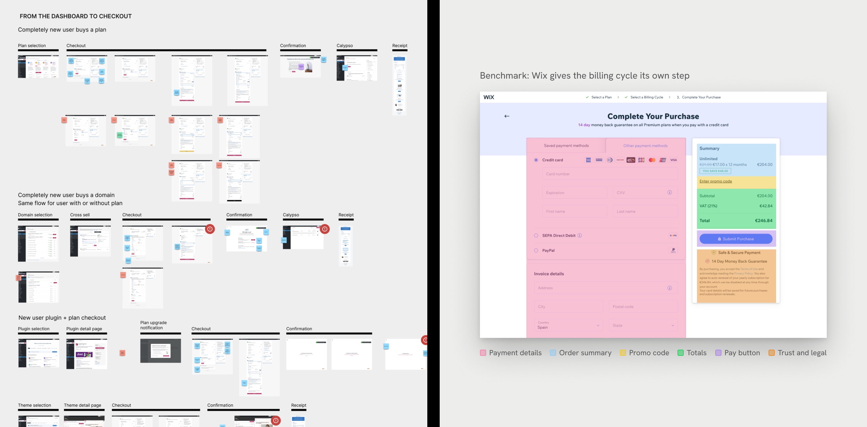
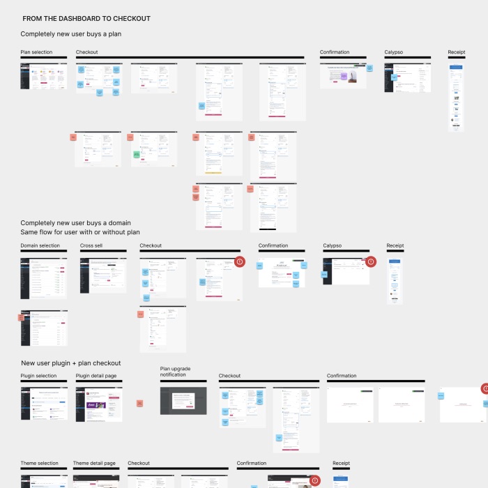
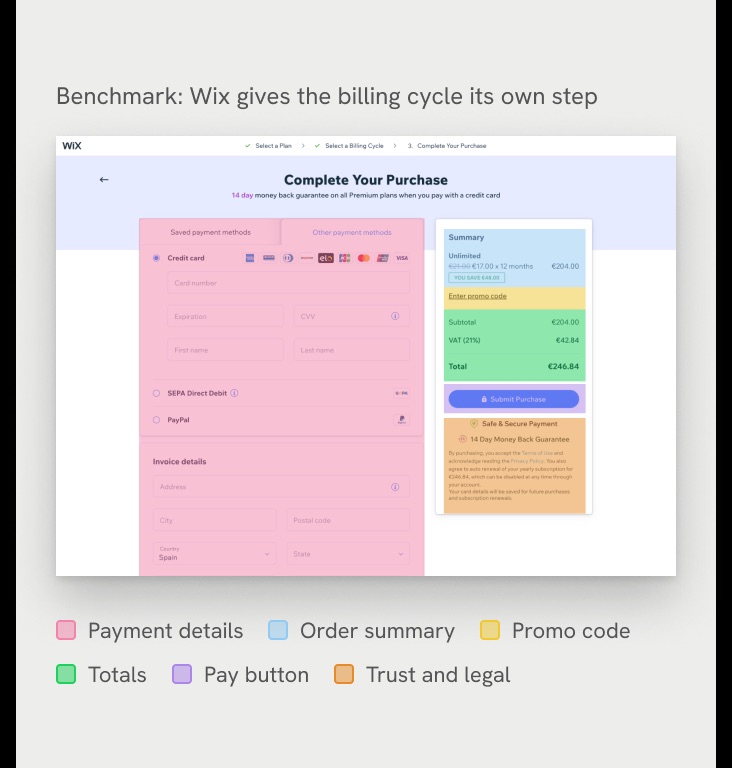
I mapped every flow that goes through checkout, so the new page would work for every product, user and billing case. I also studied competitors and the best online stores, and the best ones guide people one step at a time and always keep the order and total in view. Only Wix asks for a billing cycle, and it has its own step before payment.
03 — Explore
Different ways to organize the page.
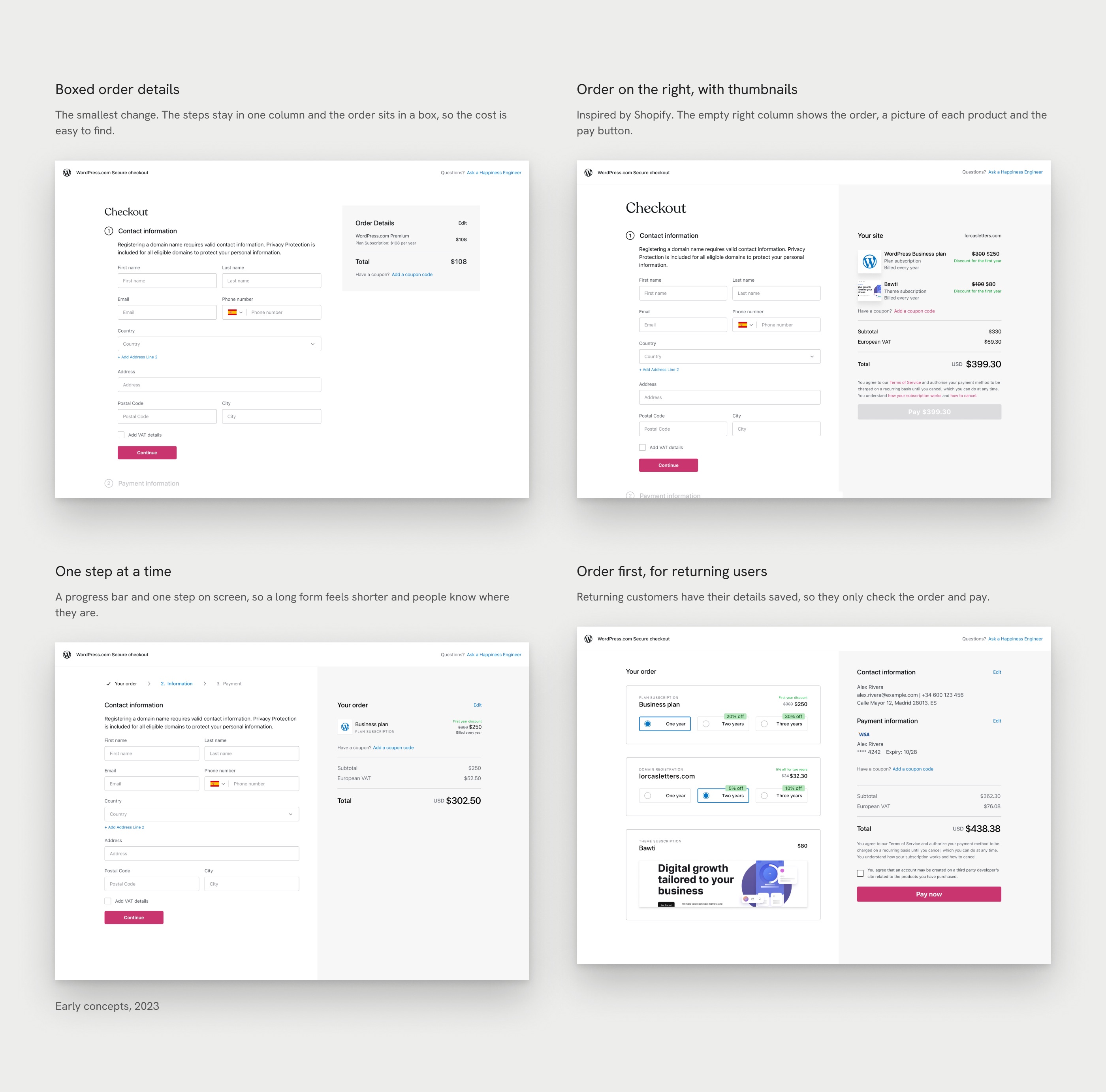
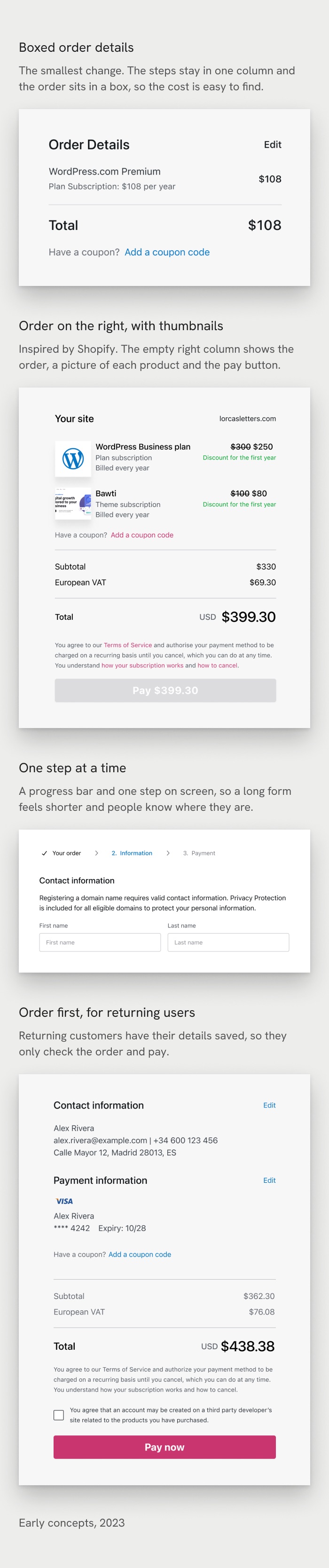
Before choosing a direction, I tried several layouts, each built on a different idea of what people need to see and when, and I shared them with the design team for feedback.
04 — Restructure the page
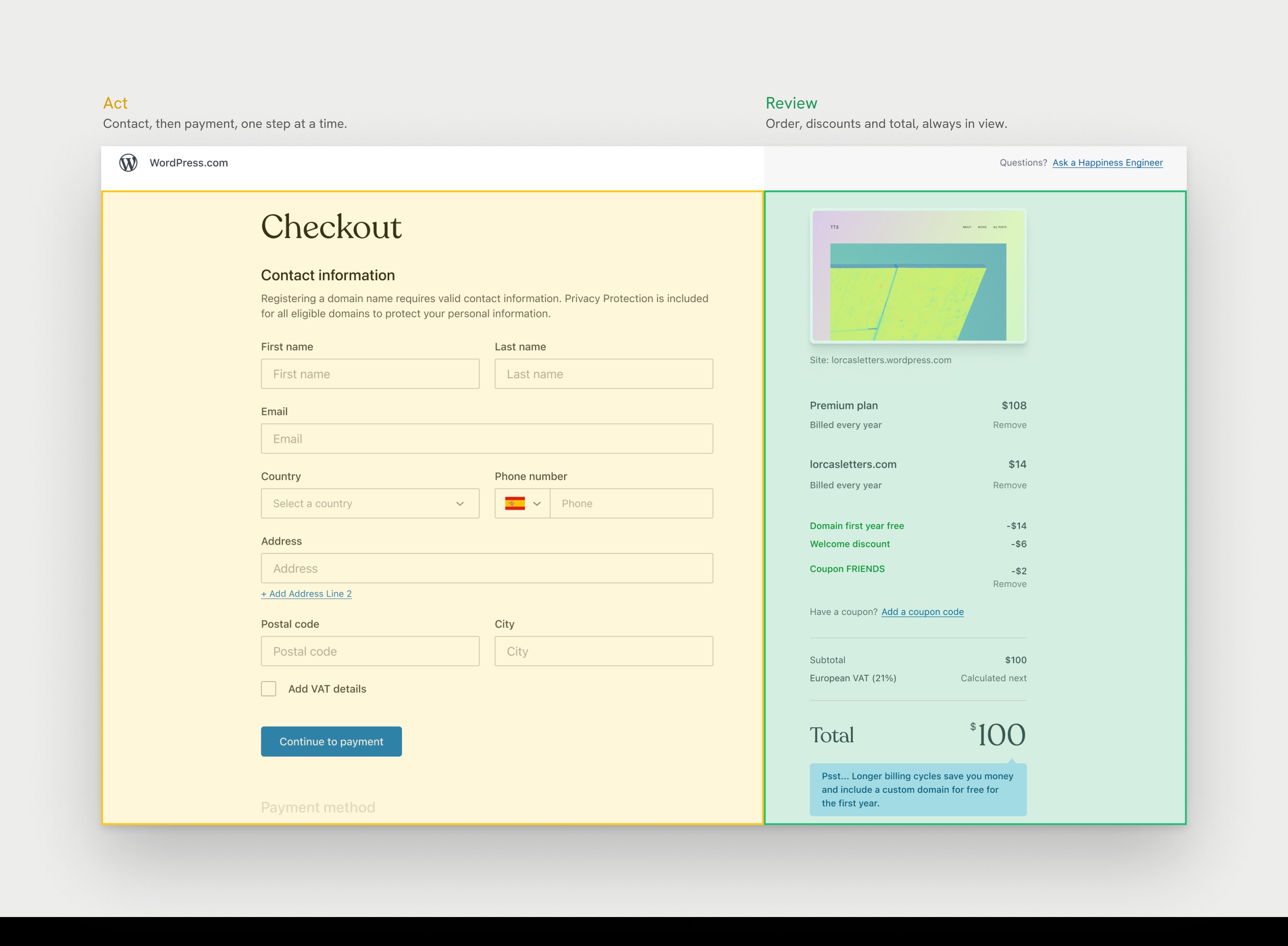
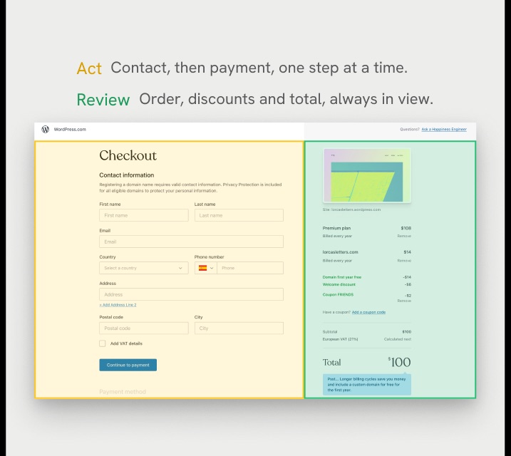
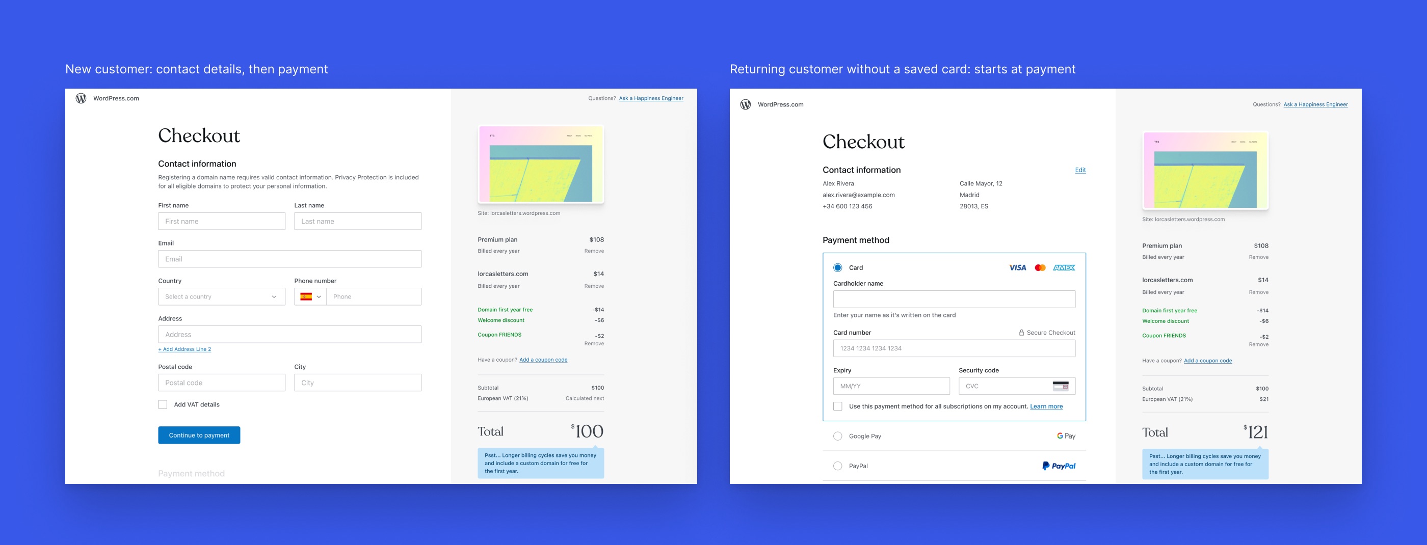
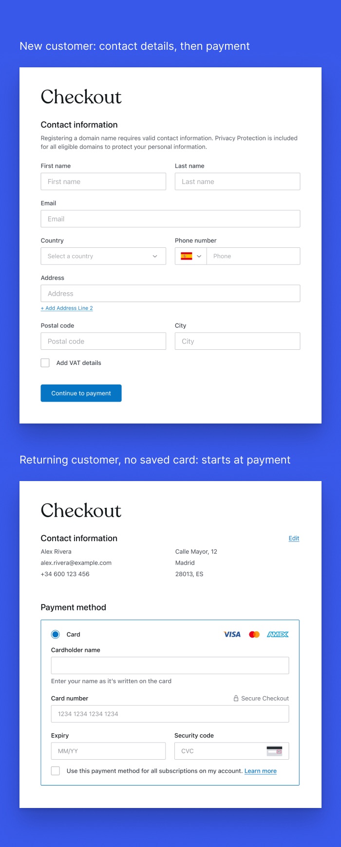
Act on the left. Review on the right.
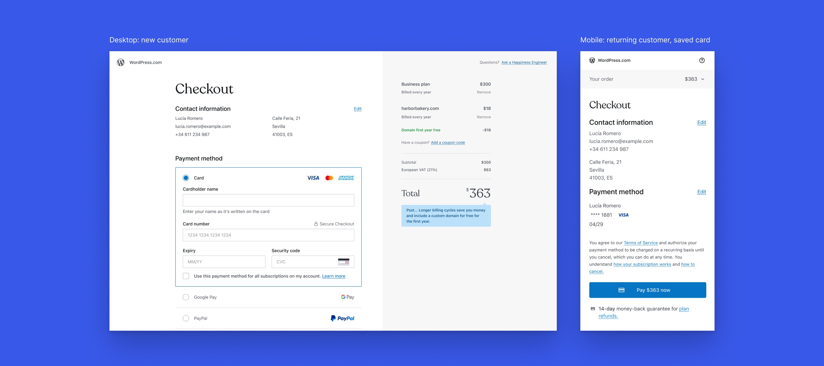
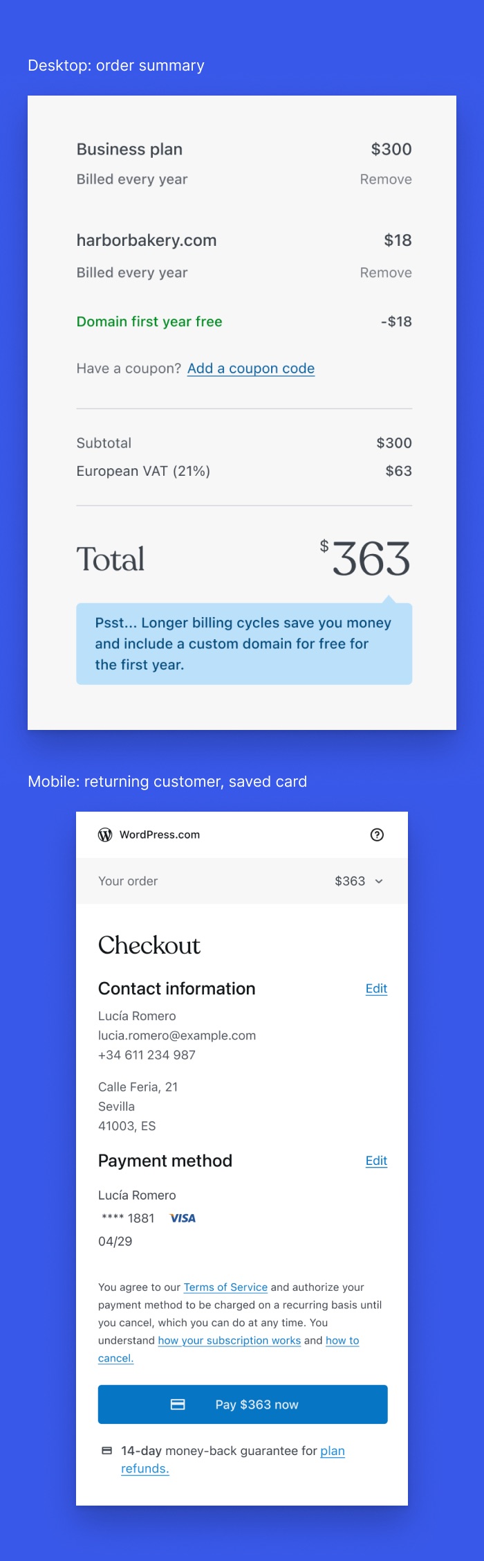
I combined the order on the right with one step at a time, because together they use the empty right column, keep the total in view and make the long form feel shorter. The left side is only for actions and the right side shows what you buy and what it costs, so less competes for attention.
05 — Documentation
Every case, specified.
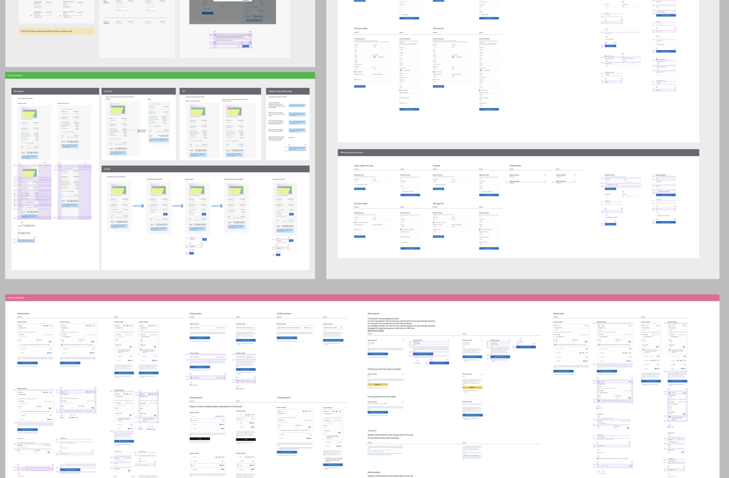
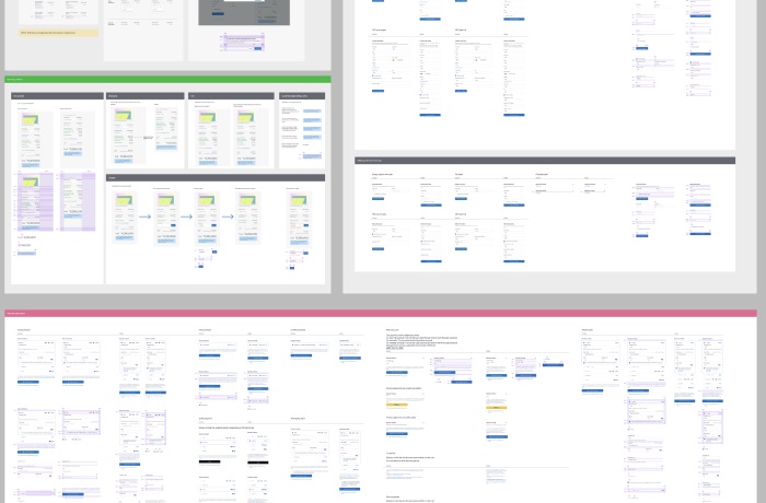
I documented the page for desktop and mobile, with the grid, the spacing and how each element behaves, plus the variants for every product and flow.
06 — A challenge
Where should the billing cycle live?
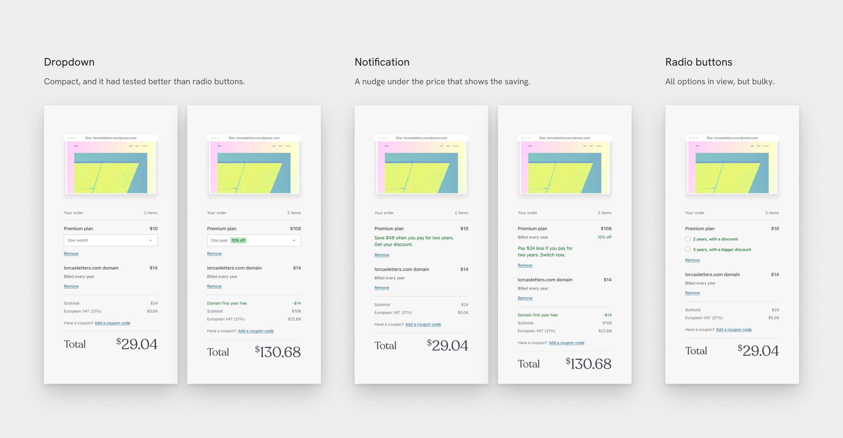
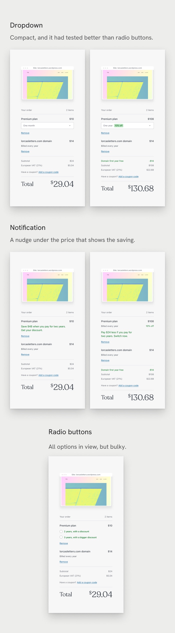
No other brand asks people to pick a billing cycle inside checkout, so there was no pattern to follow. I explored a dropdown, a notification and radio buttons, and I recommended moving the billing cycle out of checkout, into its own step right after Add to cart, because inside checkout it either adds noise or gets missed.
“The left column currently attracts the user’s focus, making the billing cycle (on the right column) less visible. This could lead to potential revenue loss…”
07 — The compromise
Commit, and reduce the risk.
Stakeholders wanted the billing cycle to stay in checkout, so I committed to their decision and worked to lower the risk. I put a compact dropdown in the order summary, since it had tested better than radio buttons, and asked for an A/B test. People picked fewer longer plans, a statistically significant drop shown below, so we rolled it back and kept the billing cycle where it was.
A/B test of the billing cycle in the order summary, against the old checkout. Rolled back. All four drops are statistically significant.
−45%2-year plan conversions
−25%3-year plan conversions
−15%Domain sales
−5%Total sales
08 — After the test
A step closer to my first idea.
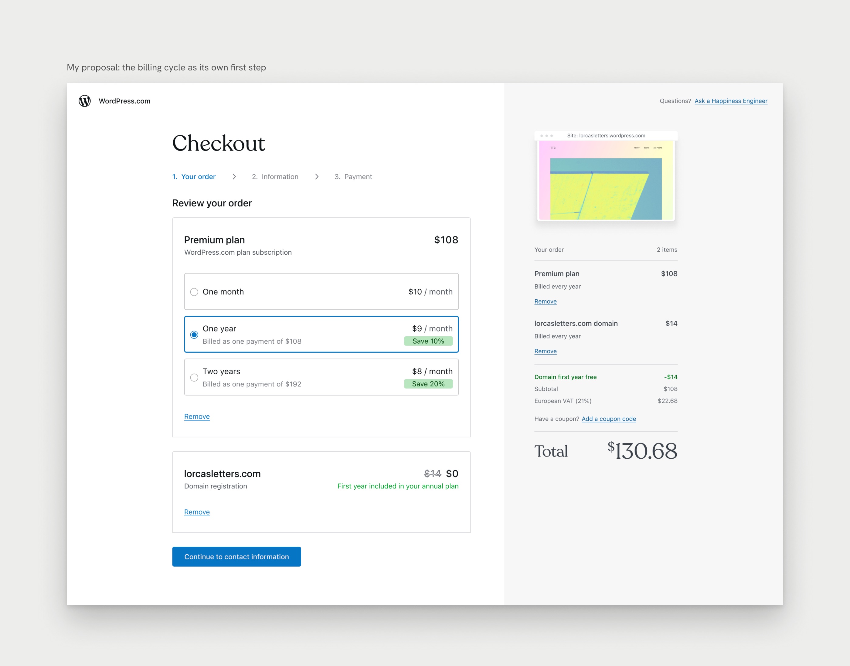
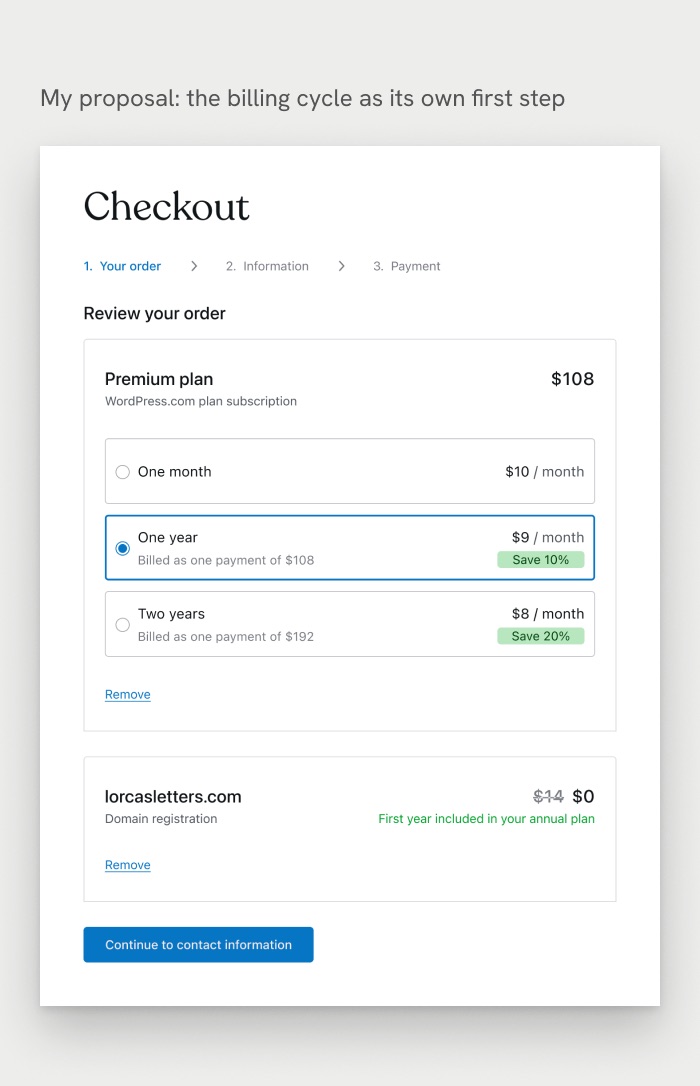
After the rollback I proposed the closest version of my first idea that fits inside checkout: the billing cycle as its own first step, “Your order”, so people choose their plan length before any forms. With a whole step for it, there is room for clear options with the monthly price, which were too bulky for the order summary. It is not built yet, but it is being seriously considered for the next version of checkout.
09 — Results
What shipped, and what I learned.
Each of the six changes had its own A/B test.
Shipped (5): the two-column layout with new styles, the folded terms, the collapsed payment step for saved cards, the features list moved to the bottom and a savings nudge, which brought more two-year upgrades.
Rolled back (1): the billing cycle in the order summary.
Still to build: the site preview in the right column, which was technically hard.
What I learned: conversion did not clearly go up, but the page became calmer and easier to read, and every small change to how plans and prices show moves revenue. That is why I still believe the billing cycle needs its own moment before any forms.
Human-centered design,
at the speed of AI.
Commerce
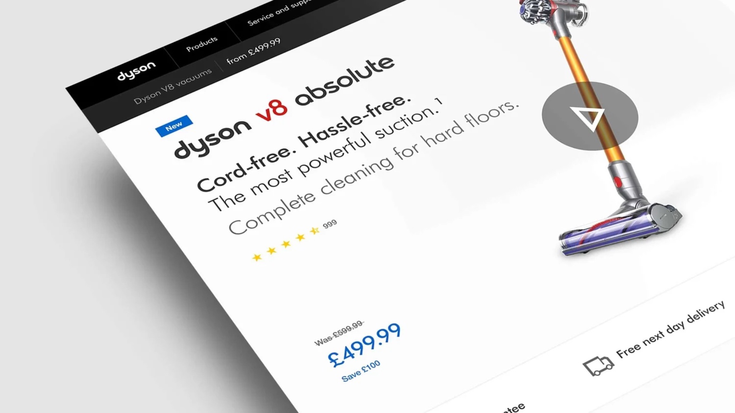
A new way to find and buy Dyson products online, in more than 10 countries. In the UK, twice as many mobile visitors bought.Dyson's online store in over 10 countries. Twice as many UK mobile visitors bought.
Loyalty
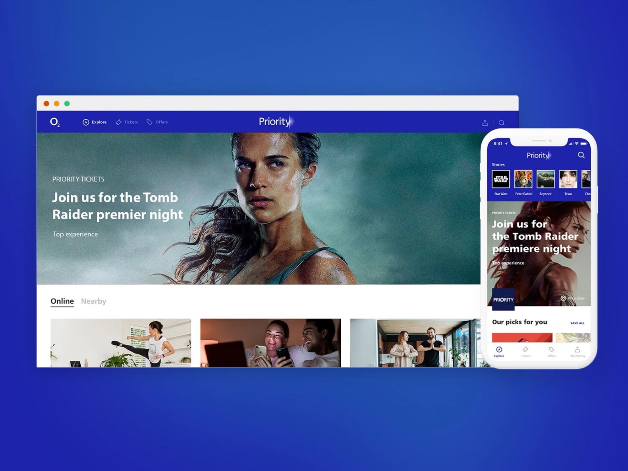
Grew O2 Priority to 2.3 million active users, ahead of schedule. Research and data showed us what to build first.Grew O2 Priority to 2.3 million active users.